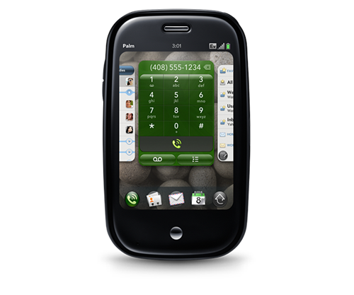
Dopo delle anticipazioni parzialmente sbagliate, è arrivato il grande giorno del nuovo Palm Pre e del nuovo Palm Web Os presentati al Ces di Las Vegas
N.d.B il video ufficiale di presentazione del Pre ricorda il feel di una nota azienda di Cupertino
 Palm Pre, di cui per ora non si conosce il prezzo e che verrà per ora distribuito solo da Sprint negli Usa da metà anno, è un ottimo mix delle cose più interessanti del software e delle interfacce dell’ultimo periodo tanto per capirsi del mondo Iphone a Android.
Il device di colore nero e curvilineo ha un touch screen con schermo da 3,1″ con risoluzione di 320 x 480 pixel e una tastiera Qwerty a scomparsa. Pesa 135 grammi. Ha UMTS, antenna GPS, fotocamera integrata da 3 megapixel con flash a led, un lettore mp3, Wi-Fi, Bluetooth, memoria di 8 GB
Tutta da esplorare l’interfaccia grafica e Palm webOS. MobileCrunch ha la “prova su strada” più interessante
Interessante notare che qualcuno parla di una seconda giovinezza di Palm. Occorre vedere che propone l’azienda dopo Pre, ora che Palm ha un prodotto ottimo per la fascia alta, mentre l’entry level è datato e ha un sistema operativo decisamente diverso …
Struggling smartphone pioneer Palm announced a new phone, dubbed the “Pre,” along with a new operating system that could give the company a fighting chance against its more powerful rivals. The new Palm Pre, announced today at the Consumer Electronics Show, is a sleek black device that evokes the iPhone touchscreen and form factor. But it is no ordinary iPhone clone. It offers a clean interface, a combination of touchscreen and keyboard inputs, and a curvy black exterior.
“This brings Palm back into the game,” said Tim Bajarin, industry analyst and consultant with the firm Creative Strategies. “It’s a very slick and solid device. Having both the touch screen and drop down keyboard is exceptional.” Palm made history with its early handheld device, the Palm Pilot, which was the first personal digital assistant to achieve widespread success. The company later broke new ground with its Treo line of smartphones, which combined PDA and cellphone features. But in recent years the company has fallen on harder times, losing market share to rivals such as Apple, Motorola and Nokia. Many industry watchers regard Palm’s widely-anticipated phone as the company’s last best shot at survival.
Via NYT
Seeking to revive its sharply fallen fortunes and produce a successor to its aging Treo device, Palm unveiled a sleek new smartphone, the Pre, on Thursday and an exclusive partnership with Sprint to distribute it. Palm executives say the touch-screen device and the new operating system inside it, WebOS, break new ground in the fiercely competitive smartphone market. The phone’s selling points include an emphasis on fast Web browsing and efficient multitasking.
Jonathan J. Rubinstein, executive chairman of Palm, resisted comparisons of the Pre with the iPhone from Apple. “Our intention was never to build an iPhone killer but to build a killer Palm product,” Mr. Rubinstein said in an interview. He said he felt Palm had been fighting an uphill battle with outdated devices and software, and was doing so no longer. “The Pre allows us to get back in the game,” he said.
Edward T. Colligan, president and chief executive of Palm, said at a press conference at the Consumer Electronics Show here that the Pre would be available in the first half of the year “as soon as possible.” The company did not disclose its price.
Mr. Colligan showed off the phone’s sophisticated interface and the way it charges on a special platform without the need to attach a cable. The Pre comes with eight gigabytes of storage, GPS navigational capabilities, Wi-Fi networking and a slide-out keyboard.
Via Engadged
Palm just got official with its new webOS platform, running on the new Palm Pre. According to the company, anyone who knows CSS, HTML and XML will be able to develop for the OS without having to learn any new languages — sounds kind of like it’s a jacked up browser with memory management, like Google Chrome. The UI itself is simple and touch-based, with flick scrolling through lists and gesture support that goes “beyond the screen.” The launcher comes up over apps without leaving them, and you can quit apps by just swiping up — multiple apps and windows are managed using a “deck of cards” metaphor. The Synergy sync system automatically manages your contacts — all you have to do is log into Facebook, Google, and Outlook. You also get consolidated IM from multiple services — so, so sweet. Typing on the keyboard brings up an instant search which pulls up apps, contacts, and even web queries. All apps have access to an Android-like popup notification system, and urgent messages pop up, causing running apps to automatically resize so you can see everything.
